Google UX Project overview
The JAI Menu is an app for an Italian restaurant. Customers can use the app to order food, track the progress of their order, and easily call a waiter for service. The goal is to increase convenience and communication between the restaurant and its customers.
The problem:
During dining, one often needs the assistance of waitstaff, such as recommending dishes, inquiring about the progress of the meal, and paying the bill, but in busy restaurants, it can be difficult to locate the waitstaff.
The goal:
Design a menu app that provides dish introductions, ordering, and tracking meal progress, as well as the ability to call clerk with one click.
Responsibilities:
Interview
Wireframing
Prototyping
Conducting usability studies
Iterating on designs
Research & Defining the problem
I created an empathy map through interviews and found that most users prioritize the presentation of images when reading menus. Only providing the names of dishes makes it difficult for them to understand what the food actually looks like. When ordering, users usually prioritize set menus, limited-time offers, and discounts. This information often relies on staff introductions because the menu may contain too much information or be difficult to understand.
Persona: Betty

User Journey Map
Goal: As a life-loving design assistant, I want to create beautiful memories and experiences during holiday gatherings.

Wireframes
I created an empathy map through interviews and found that most users prioritize the presentation of images when reading menus. Only providing the names of dishes makes it difficult for them to understand what the food actually looks like. When ordering, users usually prioritize set menus, limited-time offers, and discounts. This information often relies on staff introductions because the menu may contain too much information or be difficult to understand.

Usability studies
I conducted two rounds of usability studies. Findings from the first study helped guide thedesigns from wireframes to mockups. The second study used a high-fidelity prototype andrevealed what aspects of the mockups needed refining.
Round 1 findings
-Users need feedback after every action.
-Users need more user-friendly button language.
-Users should reach their goal with fewer clicks.
Round 2 findings
-Double confirmation is required when proceeding to the next step.
-Provide a more direct way for users to close unwanted windows.
-The effective click area of the button should be more user-friendly.
Iterating on designs
Before:
Navigation bar located at the bottom with buttons for ordering, shopping cart, and submitting orders. Older users had difficulty understanding and using the buttons.
After:
Unused buttons removed and ordering process made guided. A "Go to Cart" button added after placing an order. Clickable area of buttons expanded to include images.

Before:
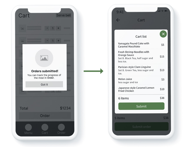
After clicking "Order" in the shopping cart, a simple feedback window will be displayed with the message "Orders Submitted."
After:
The feedback window has been updated to "Cart List" and now includes the "Total Items" to facilitate customer confirmation.

Before:
During the interview, the user expressed that when they come to this page, they want to know what dishes they haven't received yet and proceed to checkout. However, this page does not even show the prices of each dish, which can be quite inconvenient for splitting the bill during a group meal.
After:
The dish order progress will be reordered, with in-progress items displayed at the top and finished items at the bottom. Prices and "add to order" will be added.

Hi-fidelity prototype
After repeated iterations, this prototype was developed.
Accessibility considerations:
-Two language options are provided.
-Ensuring that the brightness and contrast ratio of images and text meet a minimum contrast ratio of 4.5:1.
-Using a larger font size and ensuring that buttons have larger click areas.
What I learned:
The process may seem straightforward to some, but it is not intuitive enough for those who are less familiar with using software applications.
Next steps:
-Conduct another round ofusability studies to validate whether the pain points users experienced have been effectively addressed.
-Fine-tune the design details such as spacing, font size, animation, and more.
